
Far East Flora
Project Overview
Transforming Far East Flora into a premier B2C flower destination
My team was tasked with choosing an organization with a physical experience, identifying a customer need not met by the organization, and developing a digital solution to meet user needs. The organization my group chose was Far East Flora (FEF), the leading wholesale flower company in Singapore selling flowers, plants, gifts and hampers.
In a post-COVID era where anything can be bought online, consumers are growing more and more comfortable with buying perishable goods - like flowers - online¹. FEF is already established in the local wholesale flower industry, and we were curious if we could help them expand to be a leader in the B2C industry as well.
Details
Duration
2 weeks
Team
Myself, Joyce, Philip (team of 3)
My role
-
Conducted market research and competitive analysis
to understand floral industry -
Conducted user research to understand customers
-
Used learnings from card sorting to inform
information architecture changes -
Generated digital solutions through design studios
-
Designed high-fidelity wireframes and prototypes
-
Performed usability testing on designed product
-
Iterated design based on insights gleaned during
usability testing
Tools
Figma, OptimalSort, Adobe Photoshop, Adobe Illustrator
¹Pearson, B 2019, 'Research: Half Of Shoppers Buy Perishables Online, And It’s Changing Customer Service’, Forbes, 14 June, accessed 1 January 2024, <https://www.forbes.com/>.; Ng, H and Chen, S 2020, ‘How Covid-19 is changing what Singaporeans shop for online’, The Straits Times, 25 May, accessed 1 January 2024, <https://www.straitstimes.com/>.
Please note!
Given the tight timeline of the UX bootcamp I attended, my primary emphasis for this project was on user research, usability testing, and designing solutions to address user needs. Visual aesthetic and branding were of secondary priority in this assignment, therefore, the wireframes and prototypes showcased from "Project Overview" to "Next Steps" are mid-fidelity, prioritizing functionality over visual refinement.
Following the conclusion of the bootcamp, I undertook a personal project to revisit the project and overhaul its user interface design, to enhance its visual coherence and better represent the brand. The detailed process of this visual overhaul, along with the final high-fidelity wireframes, has been incorporated into the case study's concluding section titled "Visual Overhaul." I hope you enjoy reading it!
Research
Defining our project angle
Our project brief was simply to choose a company and design digital solutions to meet previously-unmet user needs. As the brief was so broad, my team began our work by researching Far East Flora and determining the most strategic angle to take, that would bring the most value to the company.
Discovering customer needs,
goals and behaviours
We set out to understand the user by conducting 12 user interviews with flower customers. Our goals were to to better understand their needs, goals, frustrations, and past experiences. We recorded our interviews and created transcripts of the discussions we'd had. Using the data from our transcripts, we identified common trends and user insights using affinity mapping. Here are the 3 most commonly shared sentiments:
Giving and receiving flowers makes me feel appreciated and valued.
I need to trust the legitimacy of a website before I'd order from them.
I'm afraid that flowers ordered online will be delivered late or in bad condition, disappointing my recipient.
Usability testing with current FEF website
We also conducted usability tests with the current FEF website to identify usability issues and areas for improvement within the existing product.

Website aesthetic could be updated to be more modern
Some users noted their expectation for a floral website to possess aesthetic appeal, considering the visual nature of the flower trade and its inherent requirement for good design aesthetics.
Competitive & Comparative Analysis
We did benchmarking to compare FEF with its competitors and identify potential gaps in the FEF experience. We found that FEF is quite on par with its competitors in terms of website features and services provided. One area of improvement we identified was the information hierarchy of the website - FEF’s features & awards page was hidden and not easy to find.

Click to enlarge
Ideation
Developing user personas and problem statements
From our user research, we identified 2 personas amongst flower customers we would target during this project. Scroll through to learn about our personas, Percy and Samantha.
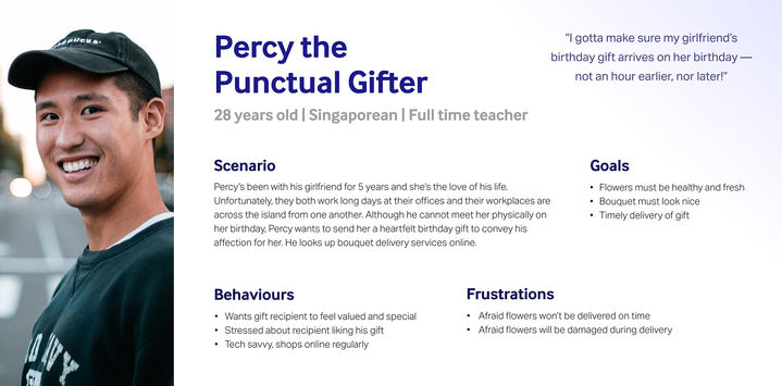
Click persona sheet to enlarge
Crafting problem statements and HMW statements to brainstorm solutions
Next, we wrote problem statements to help us clearly articulate and define the specific problems faced by each persona. These problem statements helped keep us aligned and focused as a team. Then we generated "How Might We" statements for each problem statement, brainstorming potential solutions to solve each of them. We also conducted a design studio session to aid us in brainstorming, rapidly generating sketches and bouncing ideas off of one another. Finally, after much deliberating and tweaking, we arrived at our chosen solutions for each problem statement.
Design
Please note!
Given the tight timeline of the UX bootcamp I attended, my primary emphasis for this project was on user research, usability testing, and designing solutions to address user needs. Visual aesthetic and branding were of secondary priority in this assignment, therefore, the wireframes and prototypes showcased from "Project Overview" to "Next Steps" are mid-fidelity, prioritizing functionality over visual refinement.
Following the conclusion of the bootcamp, I undertook a personal project to revisit the project and overhaul its user interface design, to enhance its visual coherence and better represent the brand. The detailed process of this visual overhaul, along with the final high-fidelity wireframes, has been incorporated into the case study's concluding section titled "Visual Overhaul." I hope you enjoy reading it!
Strategy
With proposed digital solutions in mind, we started working on the user interface design. We designed for mobile first as web traffic on mobile continues to grow, both in Singapore and worldwide².
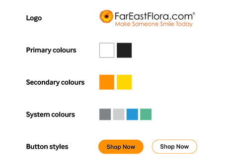
First, we created a basic set of design guidelines for FEF based on their logo, typeface and colour choices. This allows cohesiveness in the visual design across the website. Then we proceeded to design the website layout, taking the initial sketches all the way to high fidelity wireframes.
²Haan, K 2023, 'Top Website Statistics For 2023’, Forbes, 14 February, accessed 1 January 2024, <https://www.forbes.com/>
It started with a sketch...
We started with pencil and paper sketches, brainstorming how the screens could look like. From there, we recreated our best sketches in grayscale in Figma, continuously researching best practices and tweaking our designs. Finally, we had our full colour, hi-fidelity wireframes.
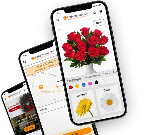
Percy's Solution
A live order tracking system that provides him with frequent status and photo updates of his order, assuring him that his flowers will be delivered on time and in good condition so that his girlfriend will be happy. The interface also provides him with a way to contact his driver or FEF to check in on his order.

Sketch

Lo-fi wireframes
Hi-fi wireframes
Testing
Usability testing
We created a usability test plan, set up test objectives for each participant based on our 2 problem statements, and determined methodology of testing and metrics by which to judge test results. Then we looked for suitable test candidates and chose 6 participants of varying ages and genders. Personas Percy and Samantha are in their 20s, hence, we found candidates within this age range.
Overall Findings
4 out of 6
participants successfully completed all 3 tasks
2/6 participants completed 2/3 tasks, failing to complete the task of locating and purchasing a particular bouquet on the website. The reason why will be explained below. Aside from this, users had no issues completing the tasks.
Average SUS Score
87.5
We calculated the usability of our website redesign using the System Usability Scale, and were thrilled to find our website scored an average of 87.5, which is a grade A.
The Glows

Users felt website layout is familiar and intuitive.
The live order tracking feature and photo updates were helpful in assuring them their order was well and on time.
The Grows — and design iterations

Finding 1:
Some users had difficulty finding the button leading them to the store page
2 out of 6 users mistakenly thought the "Build Your Own Bouquet" function on the home page would link them to the premade bouquet store, despite the subheader copy explaining otherwise. There is a button leading to the premade bouquet store page below the fold, but these participants did not scroll down, hence they missed it. They also did not explore the webpage further, and decided the link to the bouquet store was too difficult to find.
Version 1 homepage

To prevent this bad experience, we decided to tweak the flow of the homepage. The links to the store selling bouquets and other flower products will be brought above the fold so users would not miss it.
Iterated homepage
Next Steps
As our project had a deadline of 2 weeks from when we started, unfortunately we couldn’t implement all the design changes we planned to. Given an opportunity to continue working on this, we would work on the following features to further improve the FEF online experience.
We would adapt interface designs for desktop devices
First, we’d adapt all site layouts to be desktop-friendly. Although shopping online may be more convenient on mobile, some users shared during our user interviews that they still prefer online shopping on desktop because product photos are bigger on a bigger screen, so they can see product details better. A mockup of our live tracking system page on desktop is shown above.

Desktop adaptation of Percy's order tracking screen
